
Following the launch of Red Dead Redemption II, the work on Red Dead Online became an ongoing exercise in brand evolution. Building on the iconic visual identity we had established, our focus shifted from defining a single campaign to sustaining a living, ever-changing world—one that required constant reinvention while staying true to the core brand.
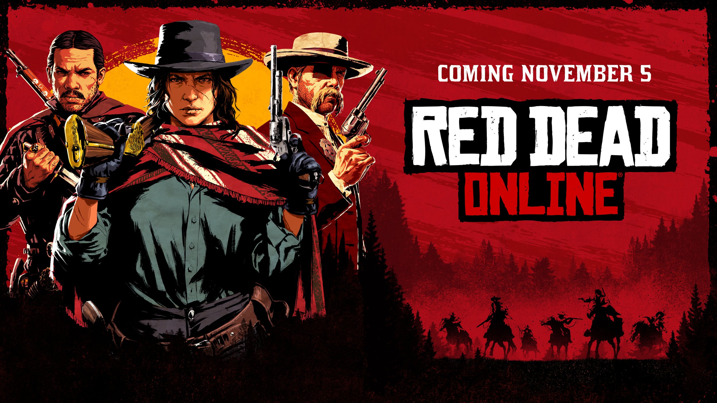

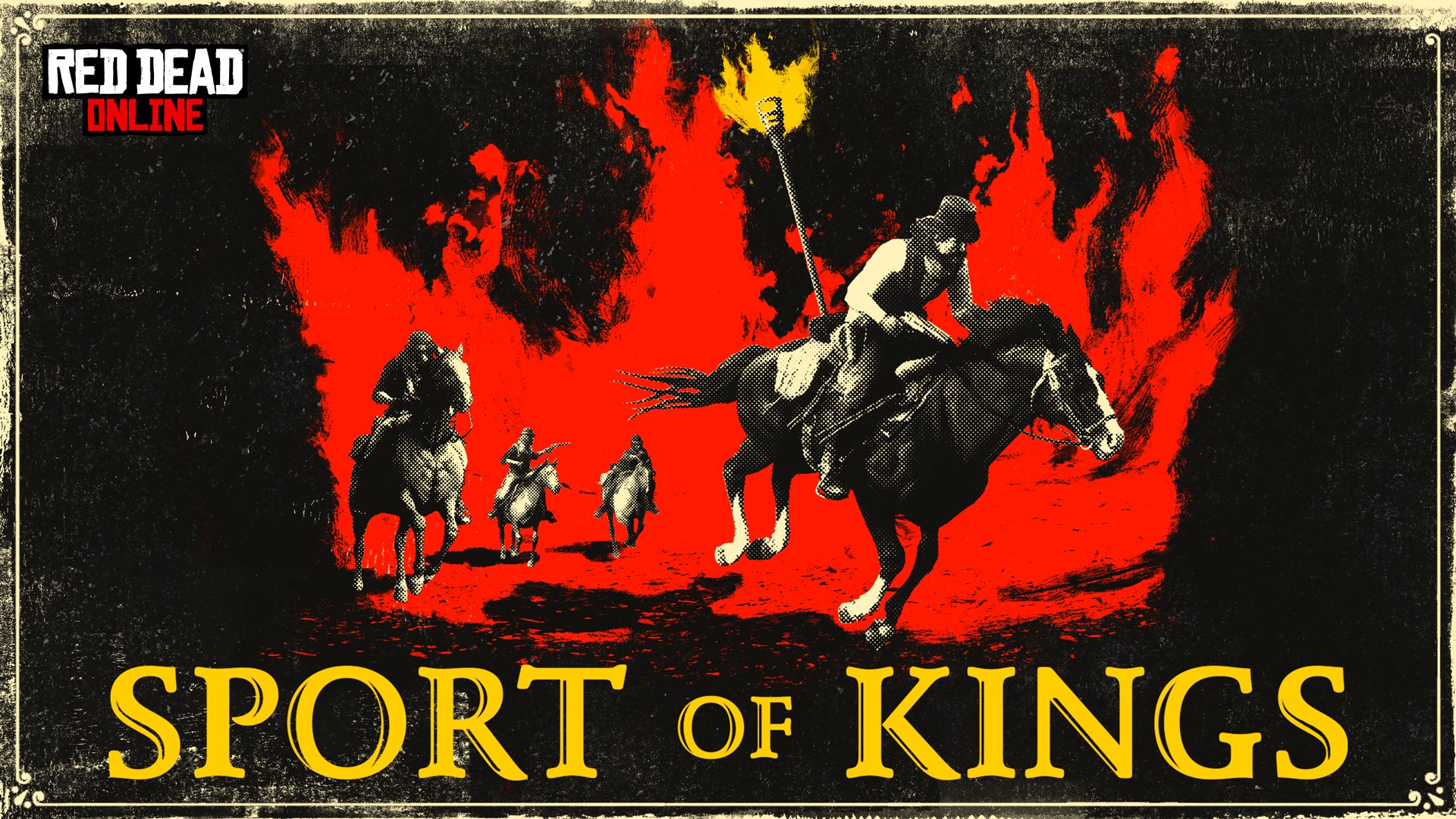


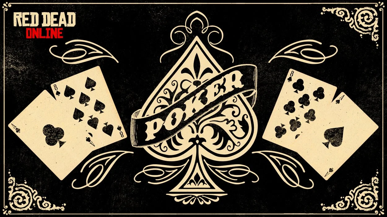

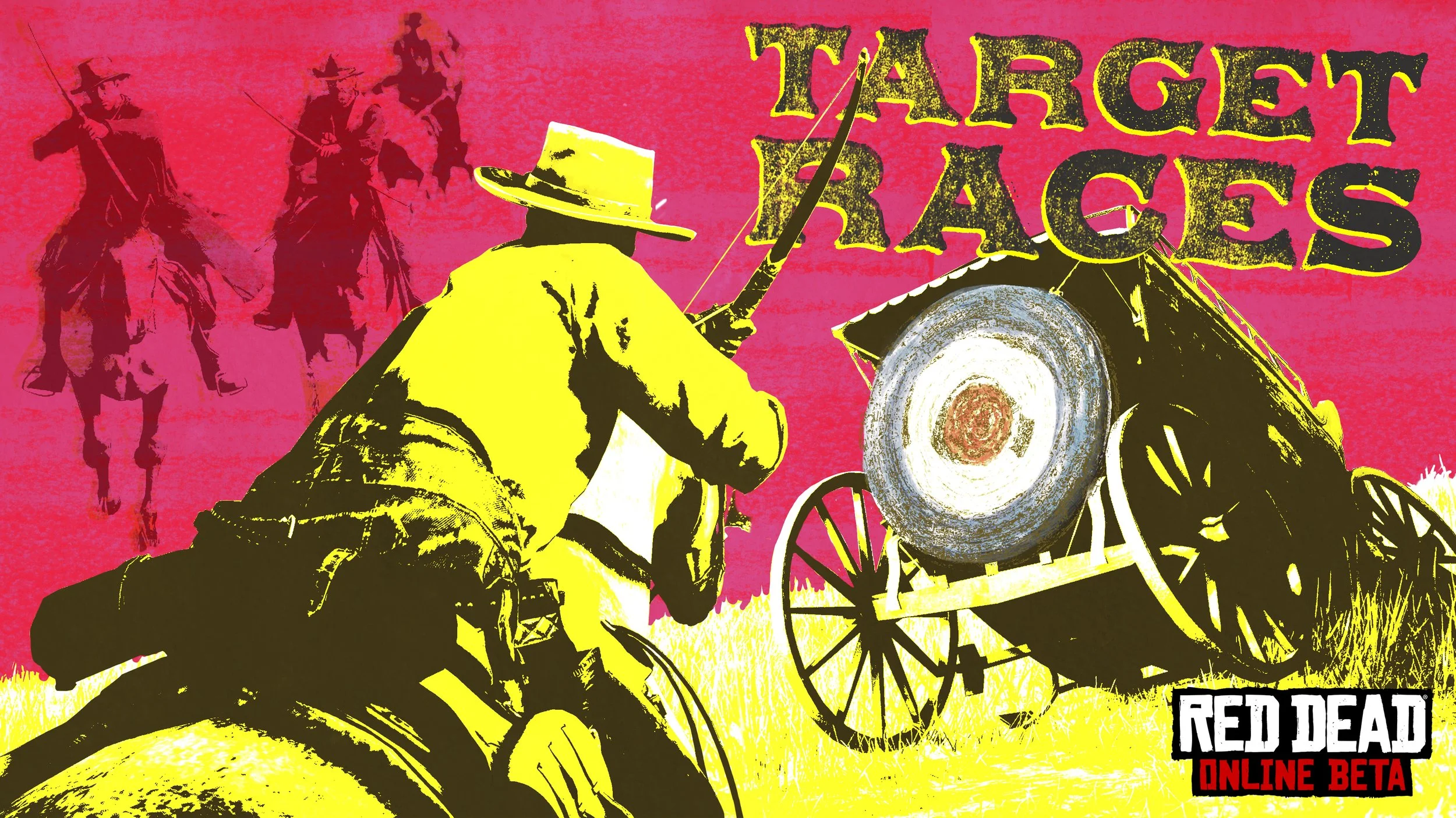
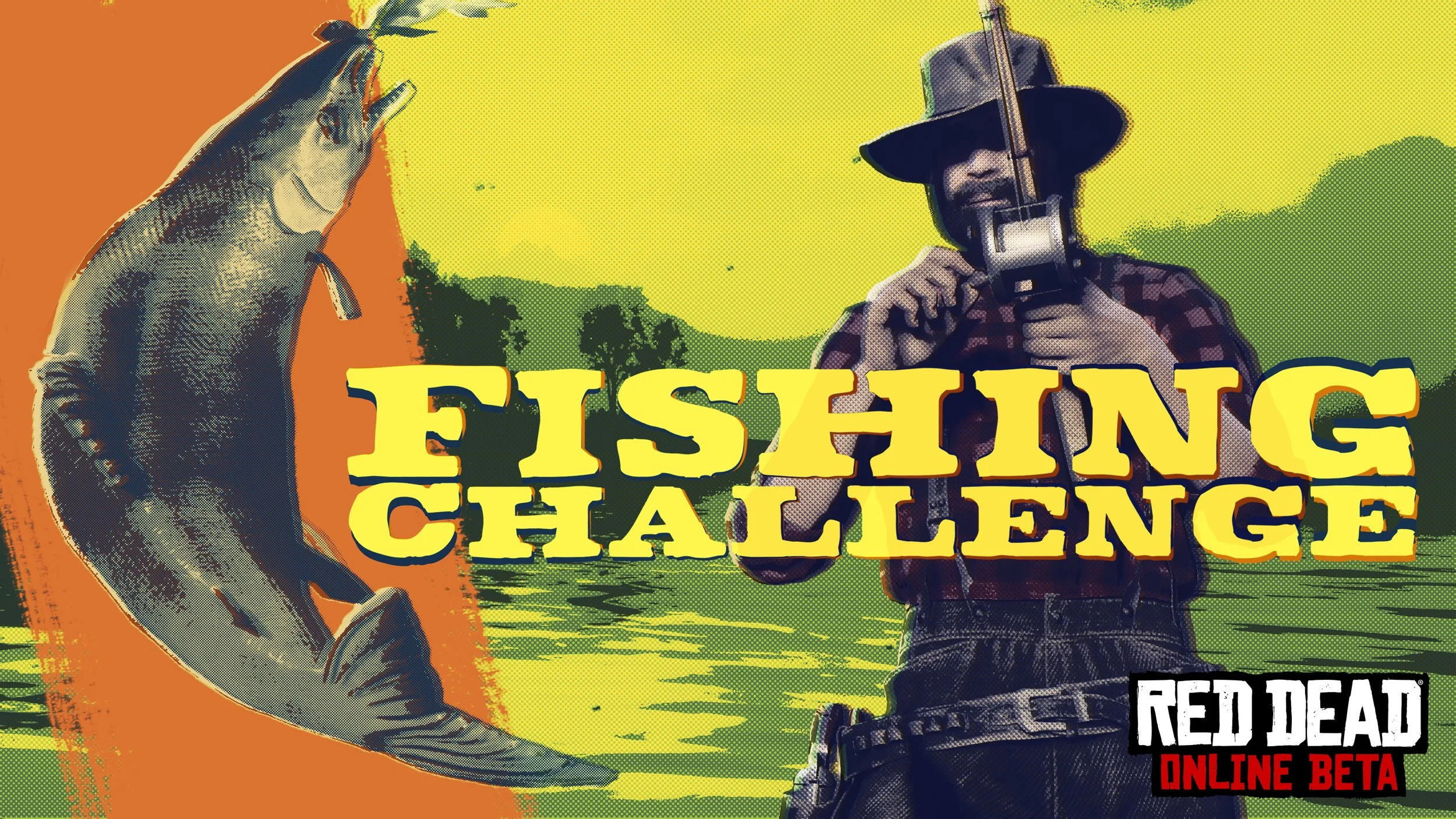


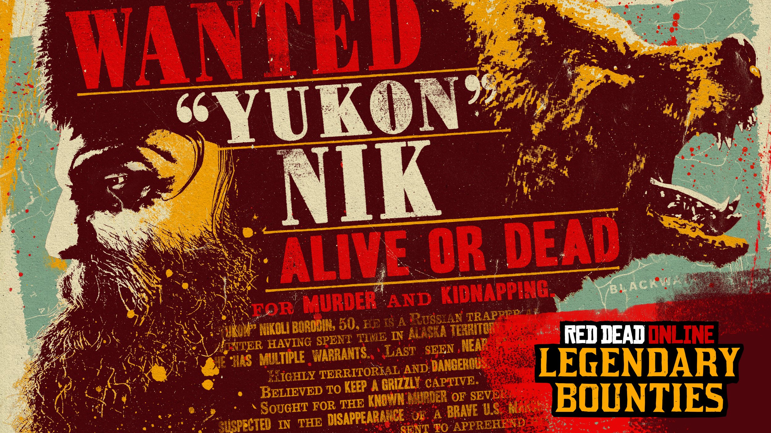
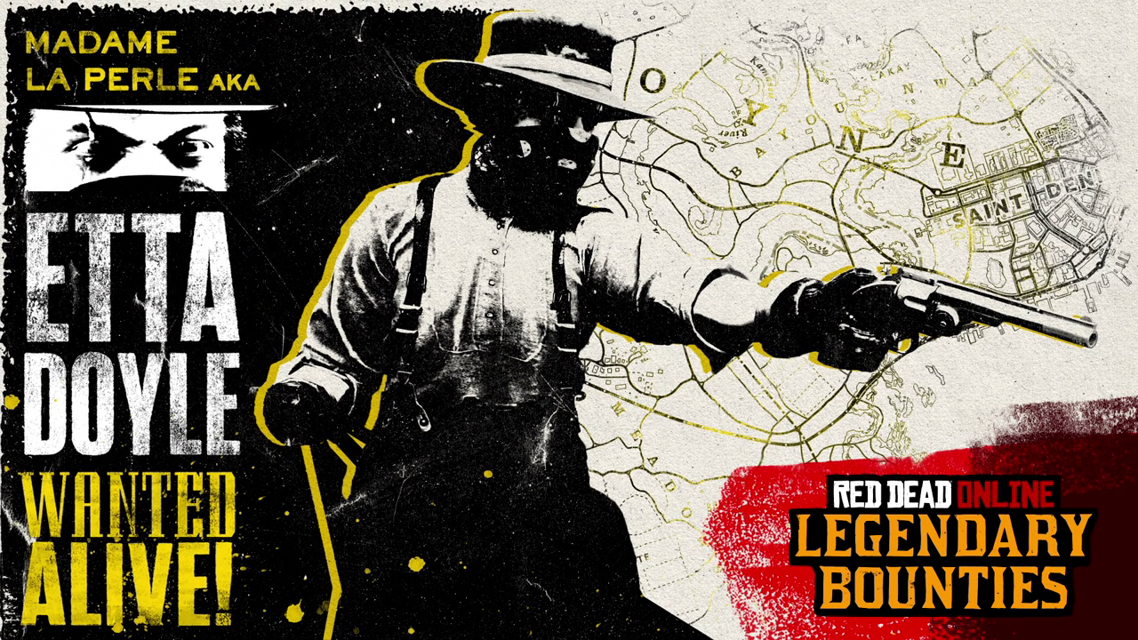
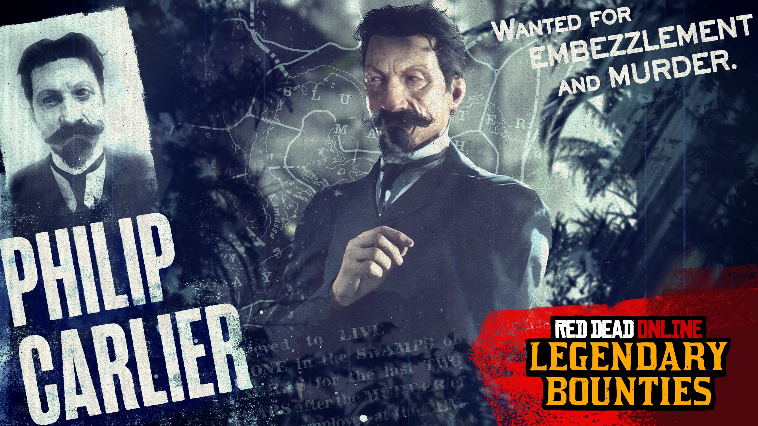
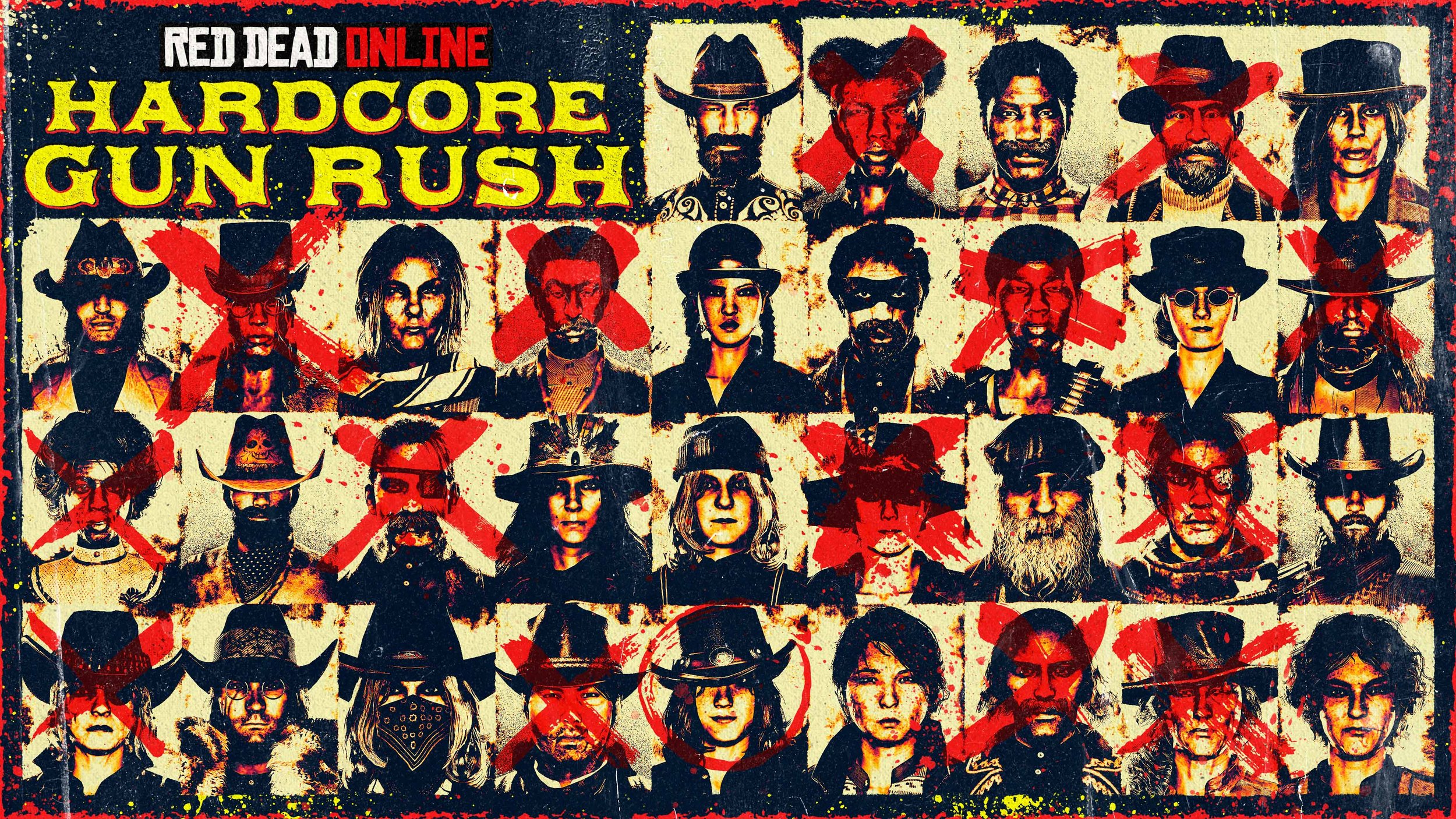
A key challenge was developing a visual approach for weekly event art that could keep pace with the game’s rapid content updates. Each piece needed to feel fresh and timely, while remaining cohesive within the broader Red Dead universe. This required a flexible system that could evolve without losing its recognizability.
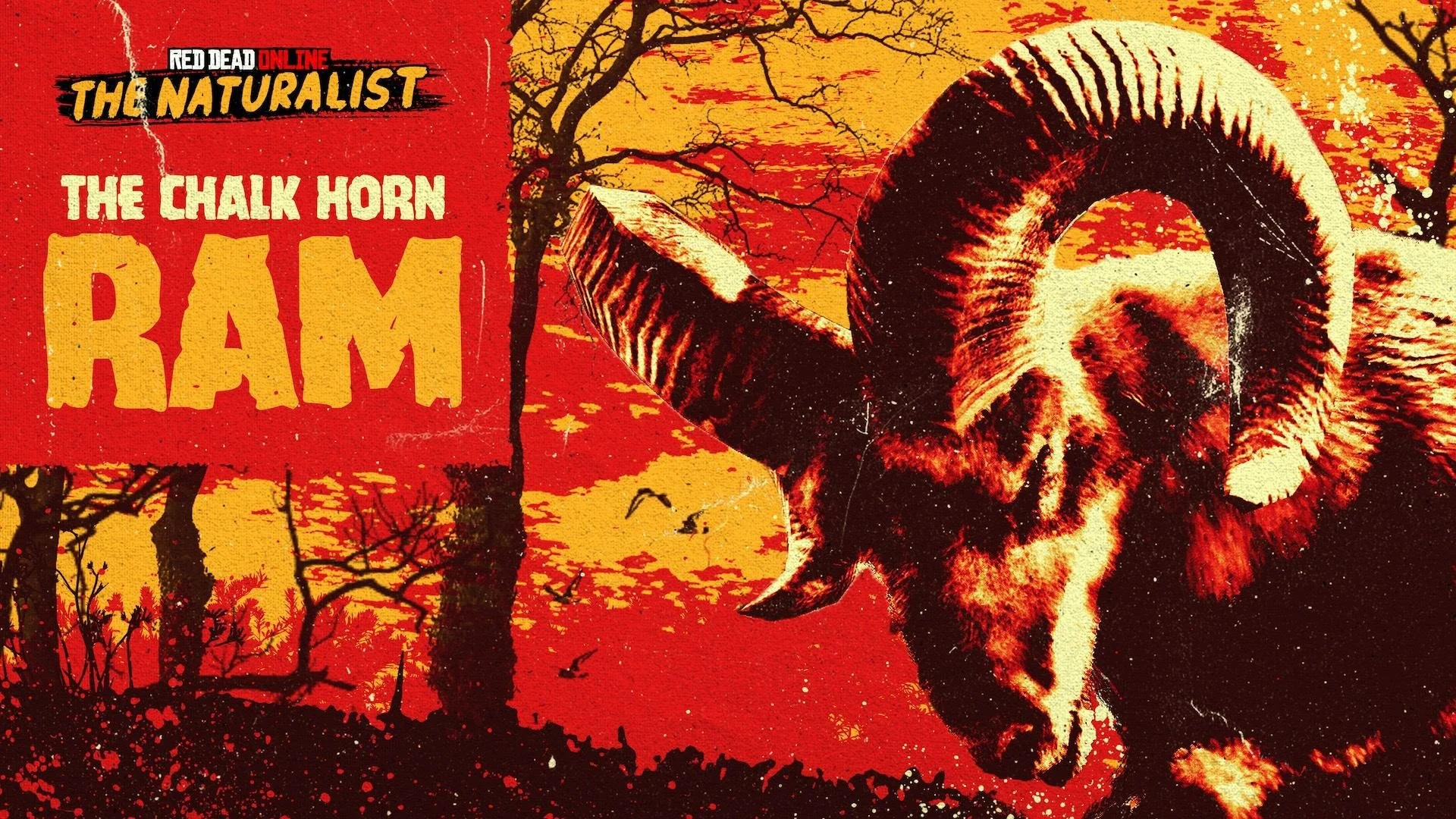
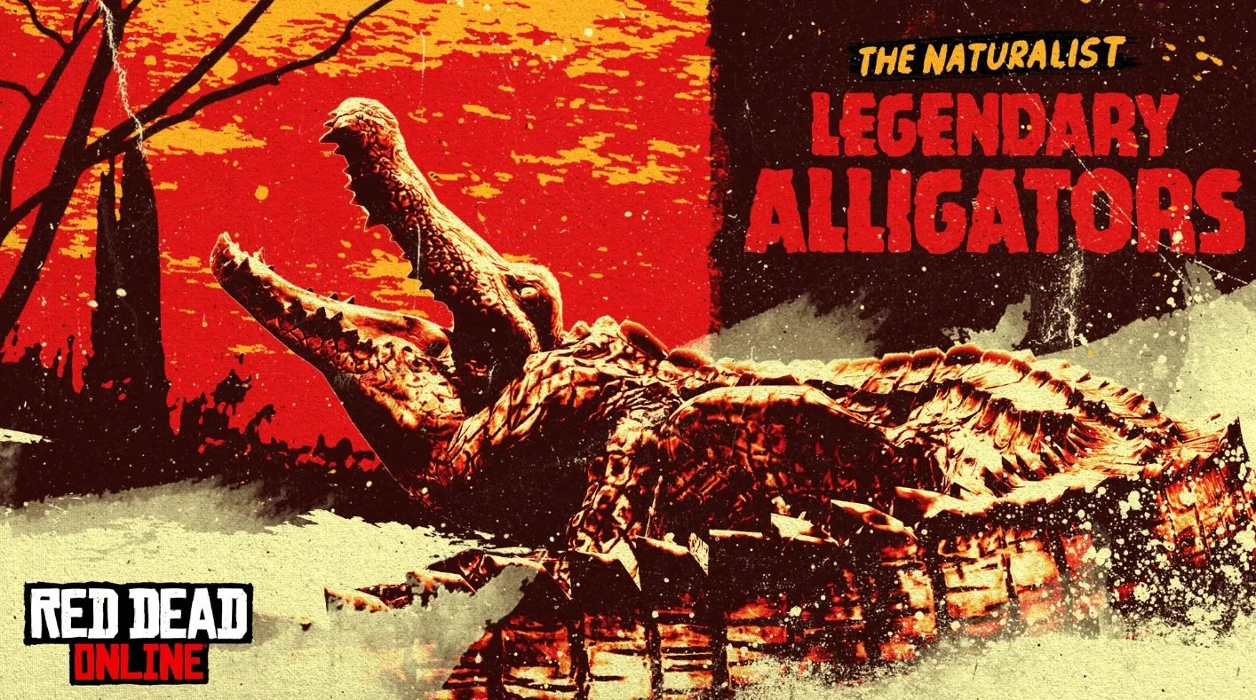
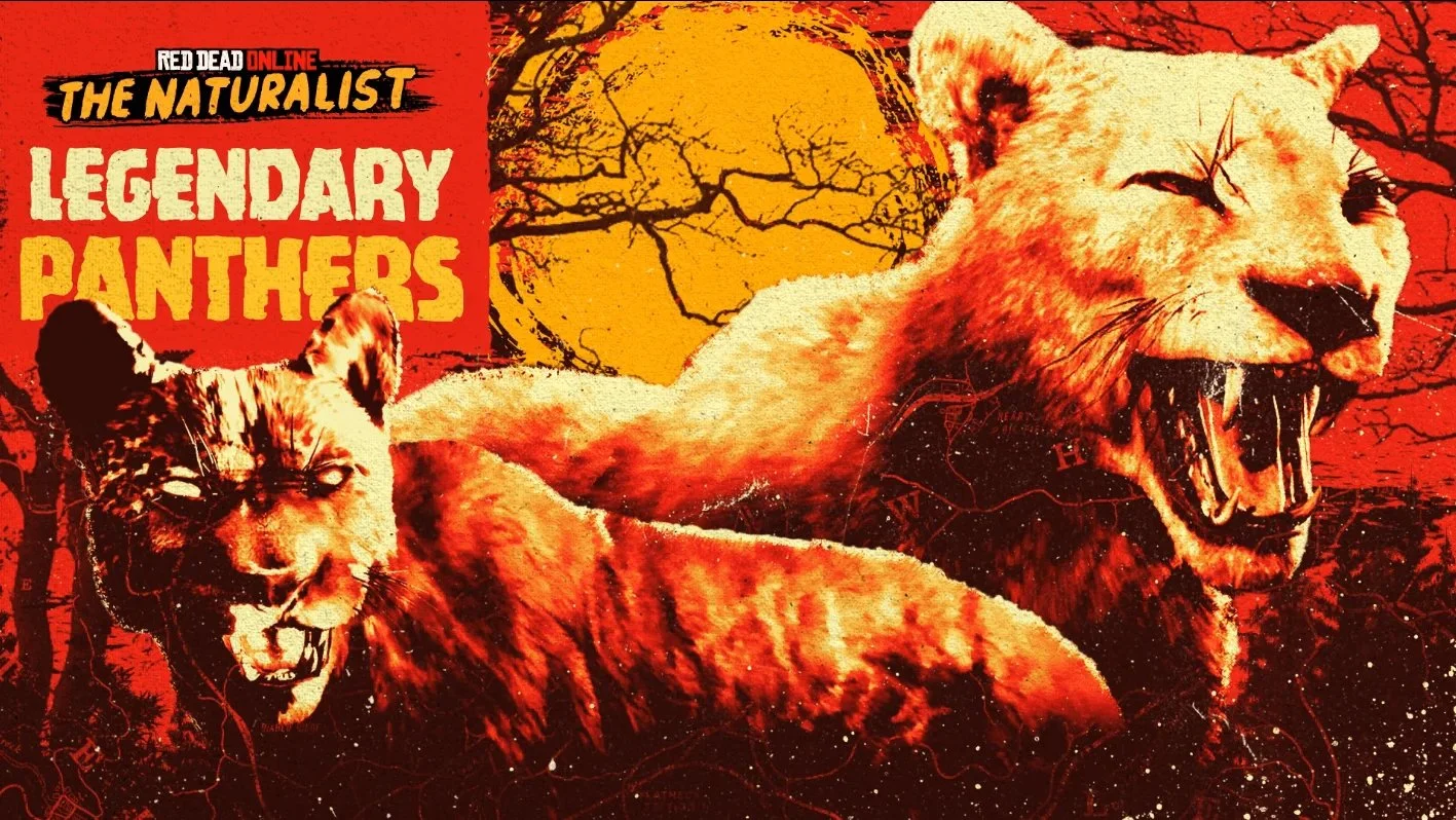
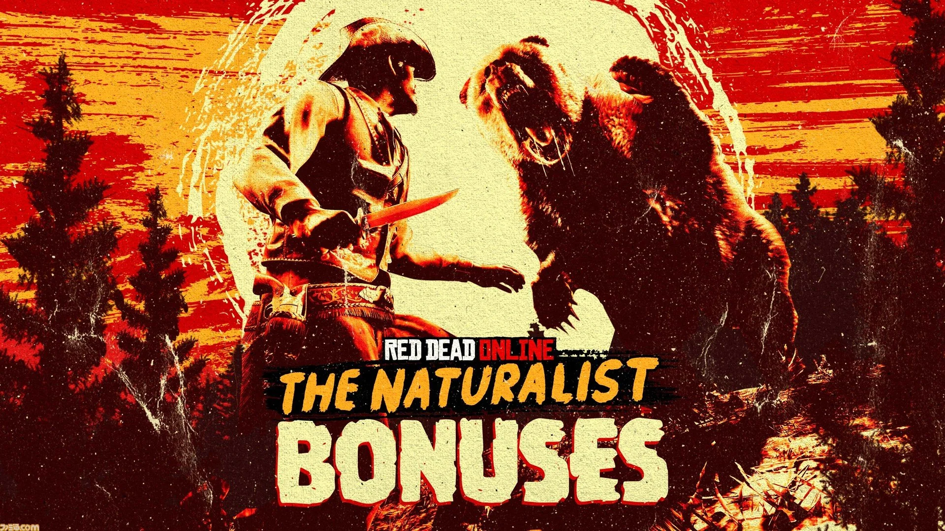
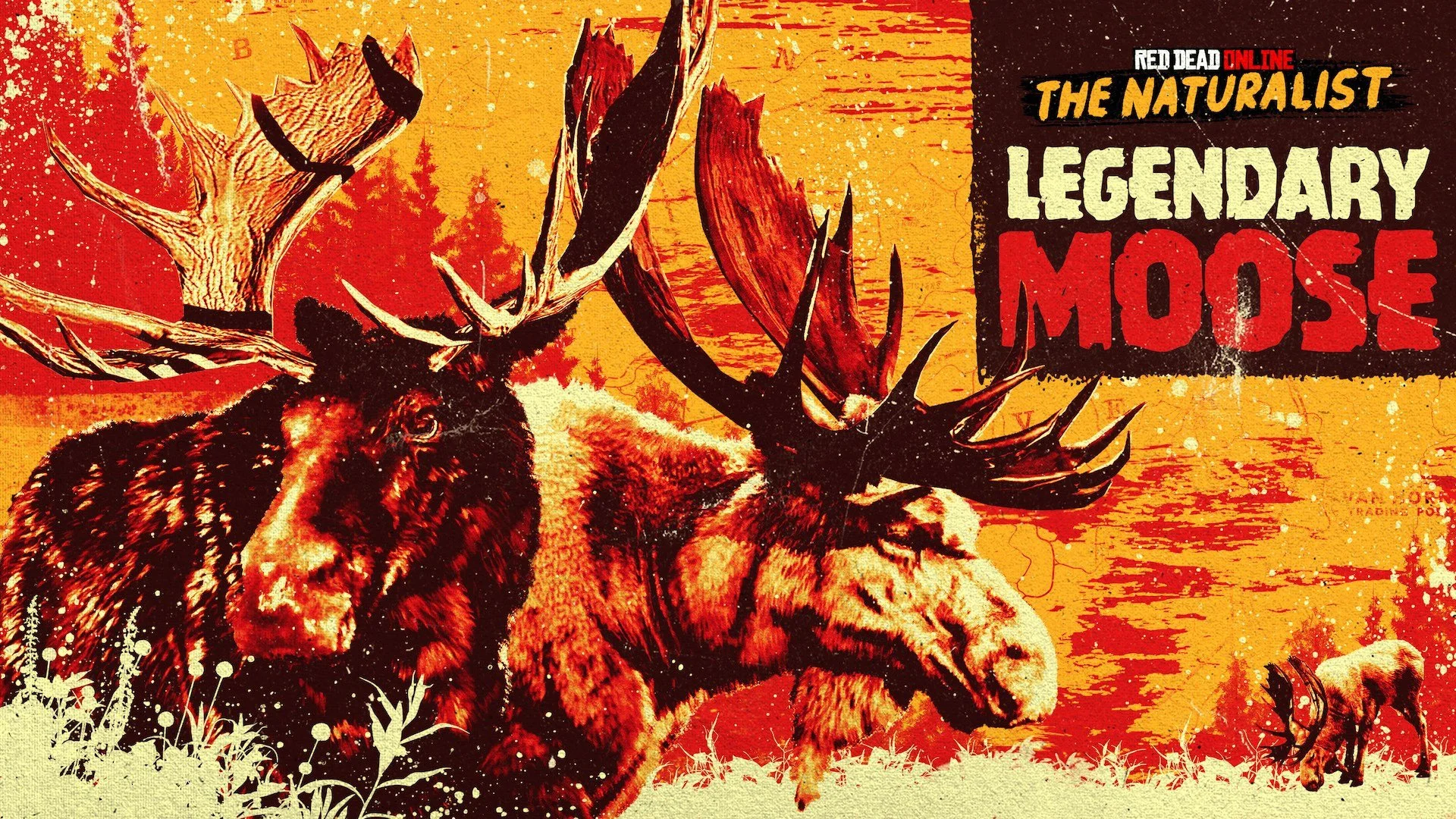
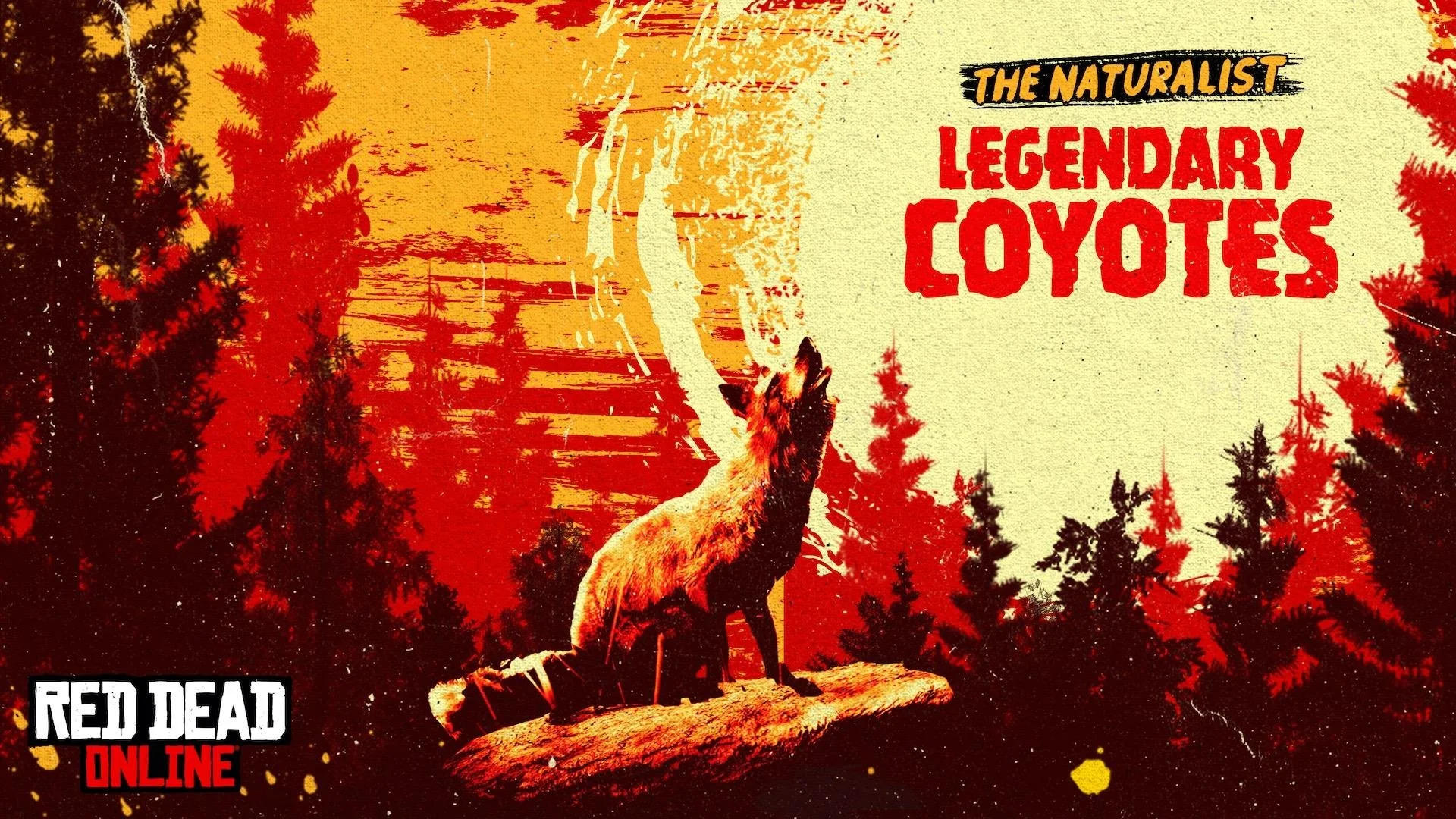
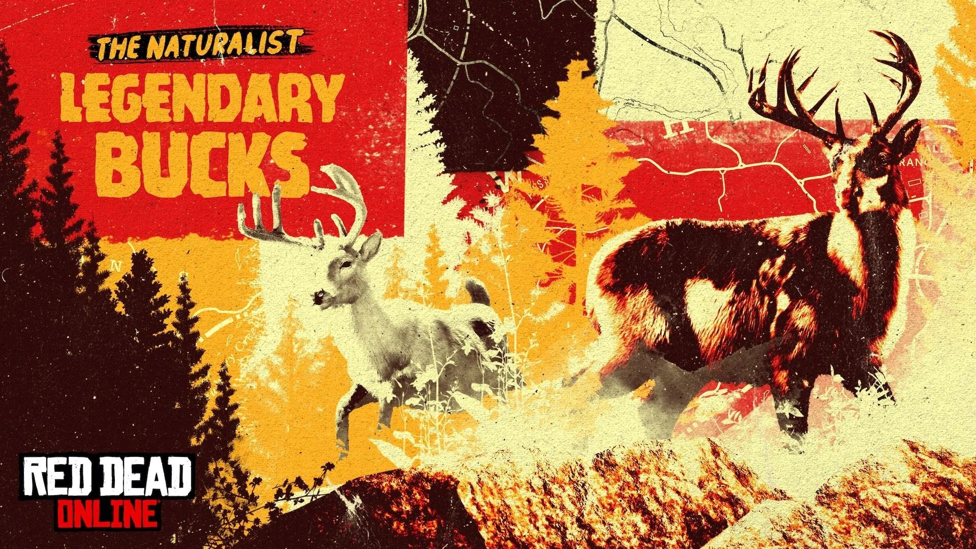
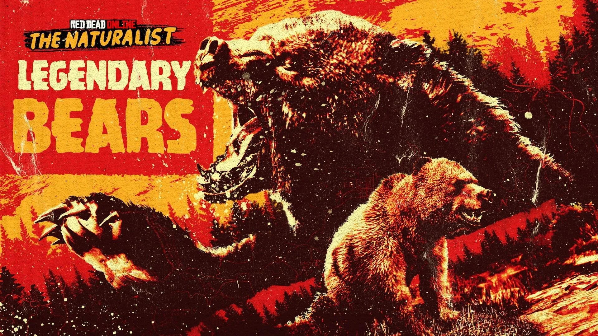
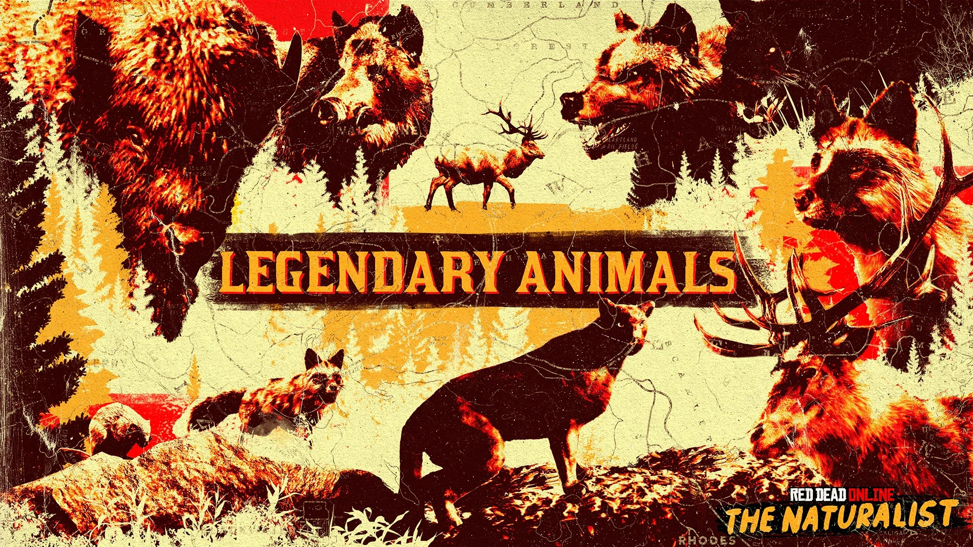
We expanded the visual language through bold color palettes, collage-inspired typography, and influences from mid-century film posters. This allowed us to highlight new content in dynamic ways, creating a style that could adapt week to week while maintaining a strong connection to the original campaign.


Ultimately, Red Dead Online became a study in continuous brand evolution—where consistency and change had to coexist. Each update served as an opportunity to reengage players, keeping the world visually compelling and ensuring the brand remained vibrant, relevant, and in motion.


