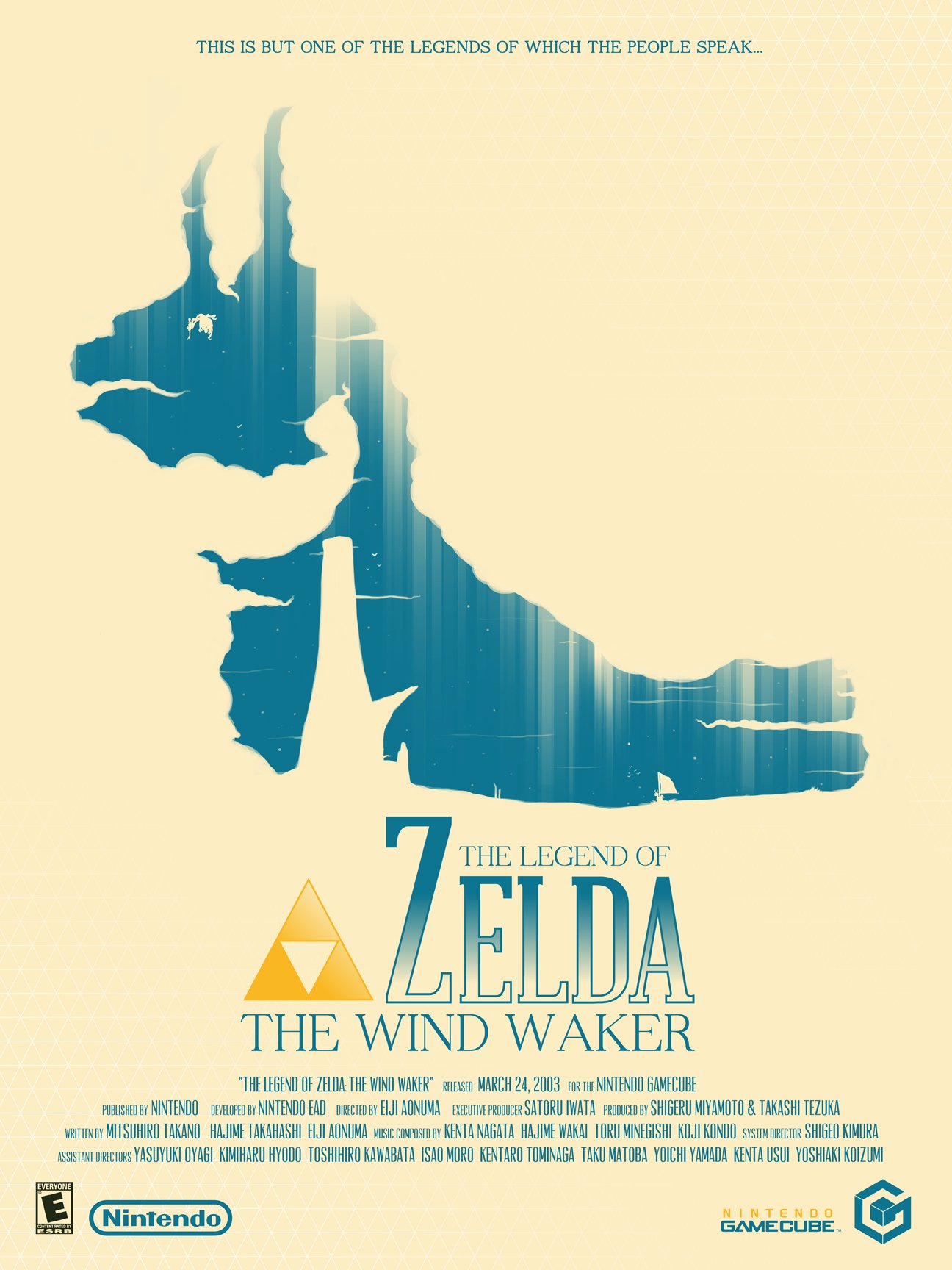
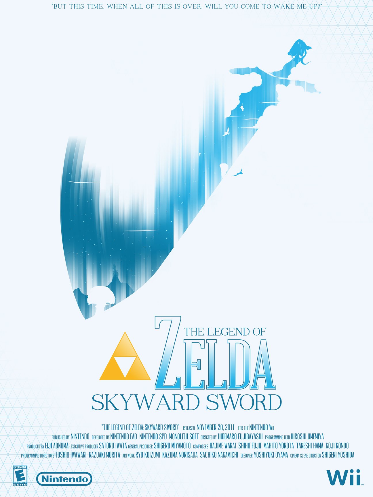
The Legend of Zelda
No franchise captures as many emotions and feelings in the player as The Legend of Zelda. Originally this series started off as a simple exercise of me trying to convey the spirit and all of the emotions you experience in as simple an image as possible for The Legend of Zelda: Ocarina of Time.
What resulted was a series of posters that has become my most signature work. A franchise like Zelda has so many wonderful locations, characters and moments that it can be easy to go all-out and try and show everything to the player, but where is the mystery in that?
Exploring that idea, I was able to come up with a wonderful framing device for each individual game and include scenes all players would remember. In a world that is constantly on the verge of falling apart, sometimes the simpler, more calm moments are the ones that stick with the player the most.


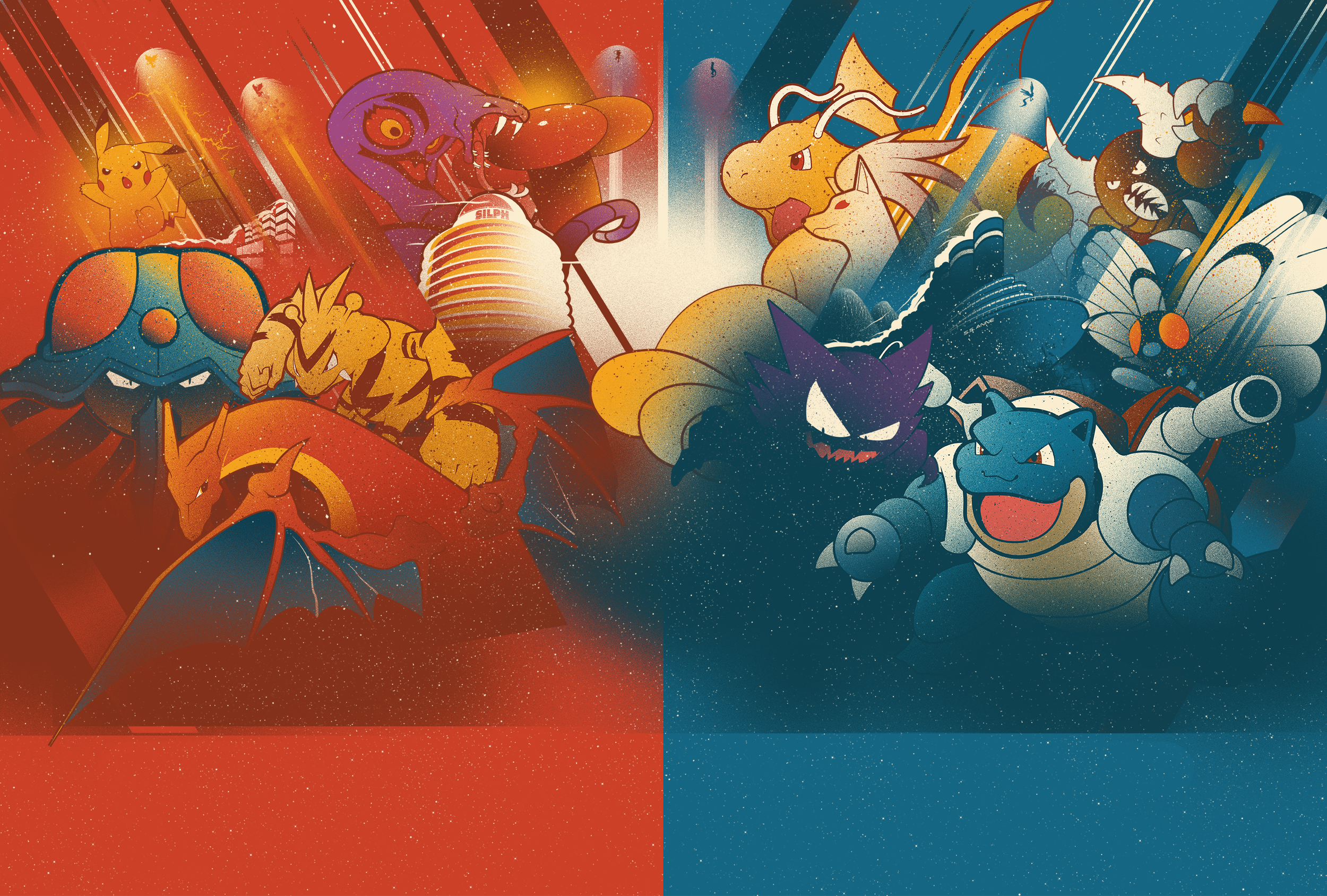
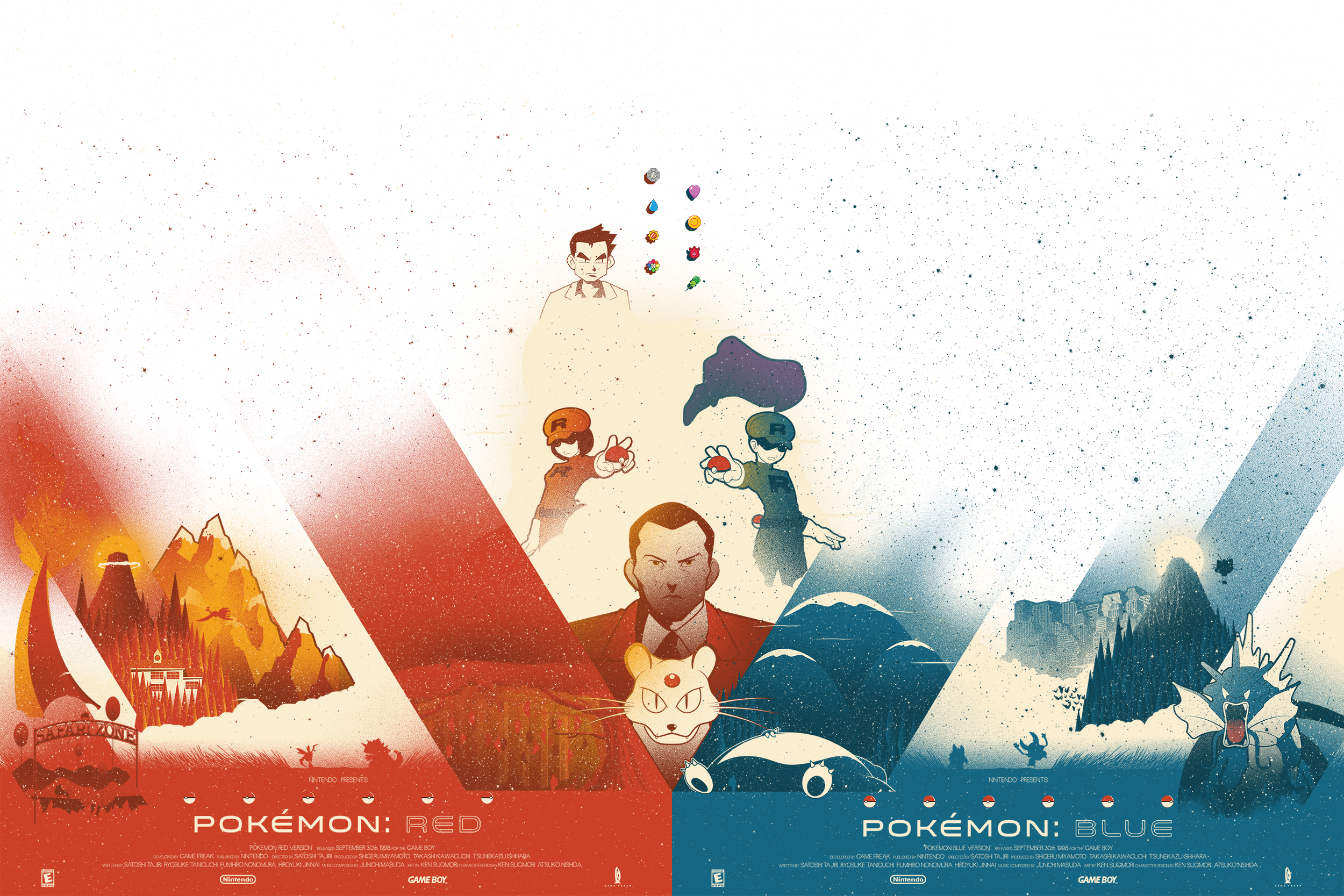
POKÉMON
Pokémon was the first franchise I fell in love with. So when creating the first set in this series I only had to ask myself “What would I include in a poster if it was only up to me?”
I decided on two seperate images to reference the two games that always release simultaneously that would then combine into one larger image. Including my favorite characters and locations to not only reference the franchise’s art style but to convey the enormous sense of adventure every kid feels the first time they delve into this world.